Production designer Patrick O’Keefe dives deep into two of the hit film’s most underrated characters, including one who is more ‘unnatural disaster’ than ‘villain’ and one based on ‘continuous noise’ and 1970s London punk rock.

Five years ago, Sony Pictures Animation changed the game of animation forever. Requiring more than 170 animators, Spider-Man: Into the Spider-Verse was not only the studio’s largest, but equally, most ambitious feature film production ever. The film’s walk-into-a-comic art style brought together decades of different illustration styles and “Spider-Man” stories, making the most of 3DCG, 2D, noir, Japanese anime, and more. Into the Spider-Verse became the new creative bar that other studios aspired to aim for in films like The Mitchells vs. the Machines, The Bad Guys, and Puss in Boots: The Last Wish.
And, in the early production stages of Spider-Man: Across the Spider-Verse, when production designer Patrick O’Keefe was asked if he and the other animators would be “doing the same thing again,” he answered, “Yeah, we are. We're going to be different again.”
“I'm grateful to have found a place at Sony Pictures where they believe style is part of the storytelling,” says O’Keefe. “We celebrate different. That’s what we do. It takes a lot of collaboration but, in the end, it’s about believing that what you’re making is art and having confidence in that. This film is made up of a thousand little pieces of art made by a thousand different people.”
Sony’s sequel to their 2018 groundbreaking Golden Globe and Academy Award-winning film is now out in theaters, directed by Joaquim Dos Santos, Kemp Powers, and Justin K. Thompson, with a screenplay by Phil Lord, Christopher Miller, and David Callaham.

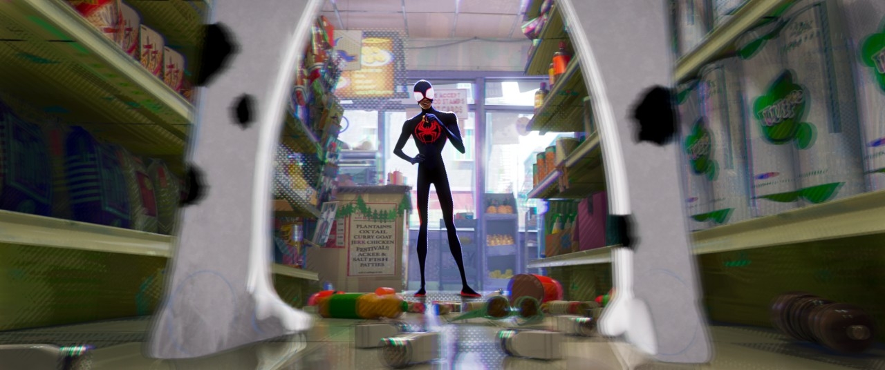
The story – which still features 3DCG and 2D styles, along with cut-out animation, LEGO stop-motion, among other styles – chronicles how after reuniting with Gwen Stacy/Spider-Woman (Hailee Steinfeld), Brooklyn’s neighborhood Spider-Man Miles Morales (Shameik Moore) catapults across the Multiverse, where he encounters the Spider Society, a team of Spider-People charged with protecting the Multiverse’s very existence. But when the heroes clash on how to handle The Spot – a new villain with a white human figure covered in black portals –Miles finds himself pitted against the other Spiders and must redefine what it means to be a hero so he can save the people he loves most.
“I would turn to Phil sometimes and be like, ‘I'm a little nervous. Are these superhero fans really looking for a Master of Fine Arts program over two and a half hours? Is that really what the superhero community is after?’” recalls O’Keefe. “But they are, and that's what this movie achieved. We’re breaking the canon of what’s expected from these films.”
One of those unexpected turns was the incorporation of The Spot, whose villain pitch was even a surprise to higher-ups.
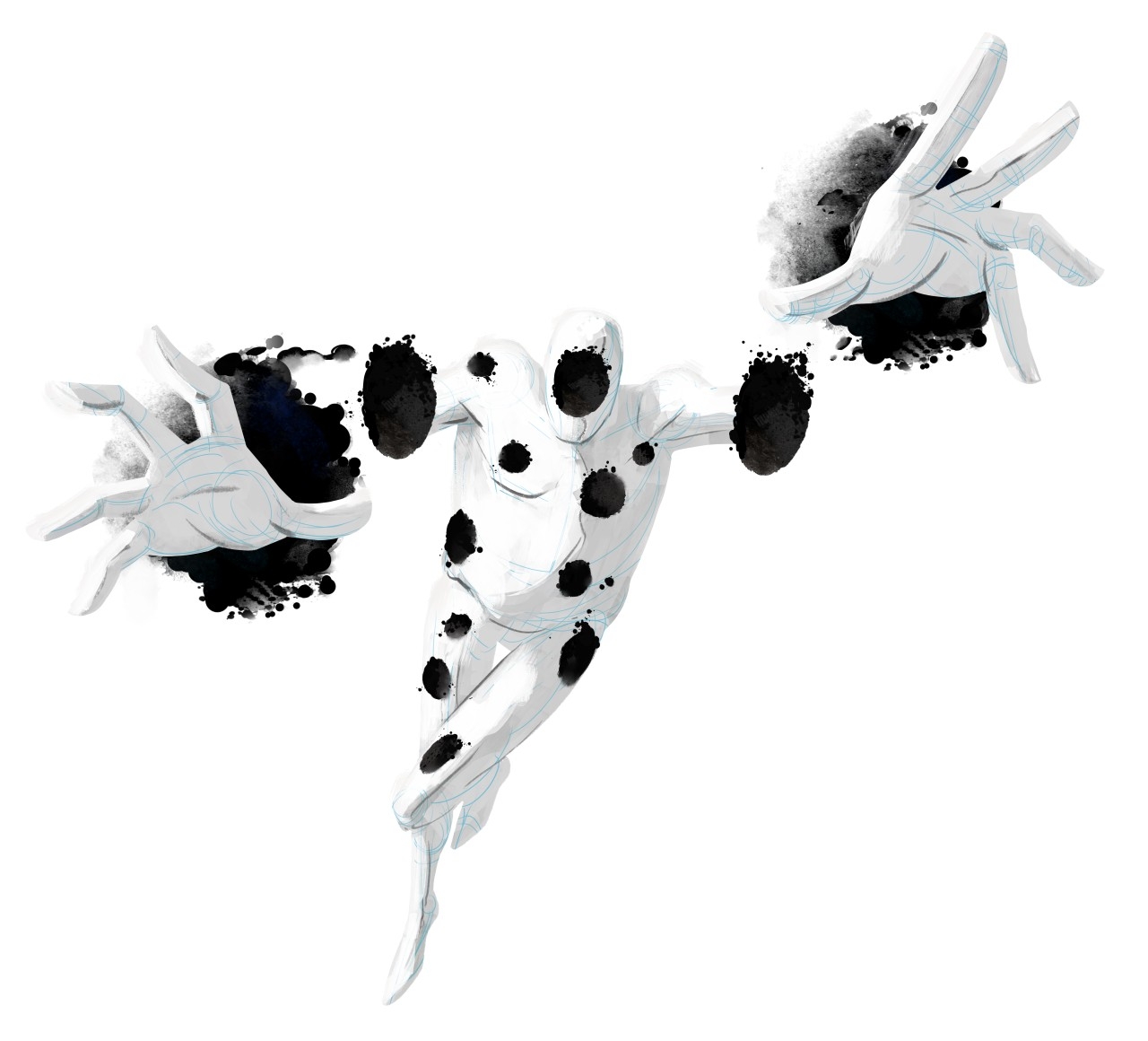
“You're known for making the most colorful, wildly detail-oriented world, and then comes this character who is the antithesis of the films,” says O’Keefe. “It’s like, ‘We have a character who’s just going to be a whiteboard with some blue pencil and ink. There's your biggest supervillain of the summer, folks!’ It takes a while for everybody to get on board with that idea.”
The Spot appears on the scene early in the film; he’s got an out-of-shape figure, no face, and can’t seem to figure out how the portals on his body work as he resorts to secretly scooting an ATM out of a store instead of robbing it. And, when confronted by Spider-Man, The Spot stands, chest puffed and proud, until bread loaves start falling out of his abdomen. He’s less than intimidating at first and, on paper, an even less appealing idea for a villain. But, put into practice, The Spot is a revolutionary villain, embodying the opposite of everything the Spider-Verse films stand for.
“The Spot is the undoing of comic book language,” notes O’Keefe. “He’s basically an illustration board with gesso on it, but you can still see the construction lines. And the ink spots that are mixing in with the gesso are chewing away at each other. I used to do scratchboard work when I was in illustration school, and if you left the ink too long on the board, it might start chewing it away. Spot’s world is like this chemical process where the world is breaking down to its core elements. So, we wanted to see the blue line pencil sketch. We wanted to see the artist’s hand at work because Spot’s very much a work in progress. If he’s moving fast, the artist is drawing fast. If that gesso isn’t dry, then ink will smear.”
“He was deceptively complex,” adds Alan Hawkins, head of character animation on the film. “It wasn’t just a matter of projecting a map of spots onto a white body. His body would break down, his portals would bleed and disintegrate, and, as the film goes on, Spot looks less like a dalmatian and more like he has a growing disease. There was also the integration of the effects department’s portals and spots and swirls. We would do things where, if Spot was going to throw a portal towards Miles, we want a bunch of spots to collect in his arm first to indicate those things.”

In fact, The Spot was less like a character and more like, in O’Keefe’s words, “an event.” He was less villain, more unnatural disaster. Less introduction, more interruption. Not unlike the much more colorful and just as complex character, Hobie Brown, or “Spider-Punk,” another Spider-Man from Earth 138 who becomes fast friends with Miles and the kid’s vital ally in the movie.
“The way he’s set up in the story, you’re initially very wary of him, but then he turns out to be exactly what Miles needs,” explains Hawkins. “It took a lot of work, but Hobie turned out to be one of my favorite characters in the film.”
If The Spot is the antithesis of comics and Spider-Verse’s multi-media mashup marvel, Hobie is a call-back to the catalyst of untamed creativity and, arguably, the origins of Spider-Verse’s boundary breaking style.
“When you're working with a film like this, whose story’s got this rich history, there's a lot of traditionalism in there and, of course, that's all been taught to the artists as well, like, ‘This is how you do things,’” notes O’Keefe. “There was a lot of breaking our own rules and having to become punks of our own along the way, where you're just going with your gut and putting a huge piece of tape on screen. Hobie doesn't believe in consistency. So, we had to throw out some of the traditional norms of easing people into emotionality and easing people into these changes. Instead, we just slap people in the face with the feeling and yell at them on the screen.”

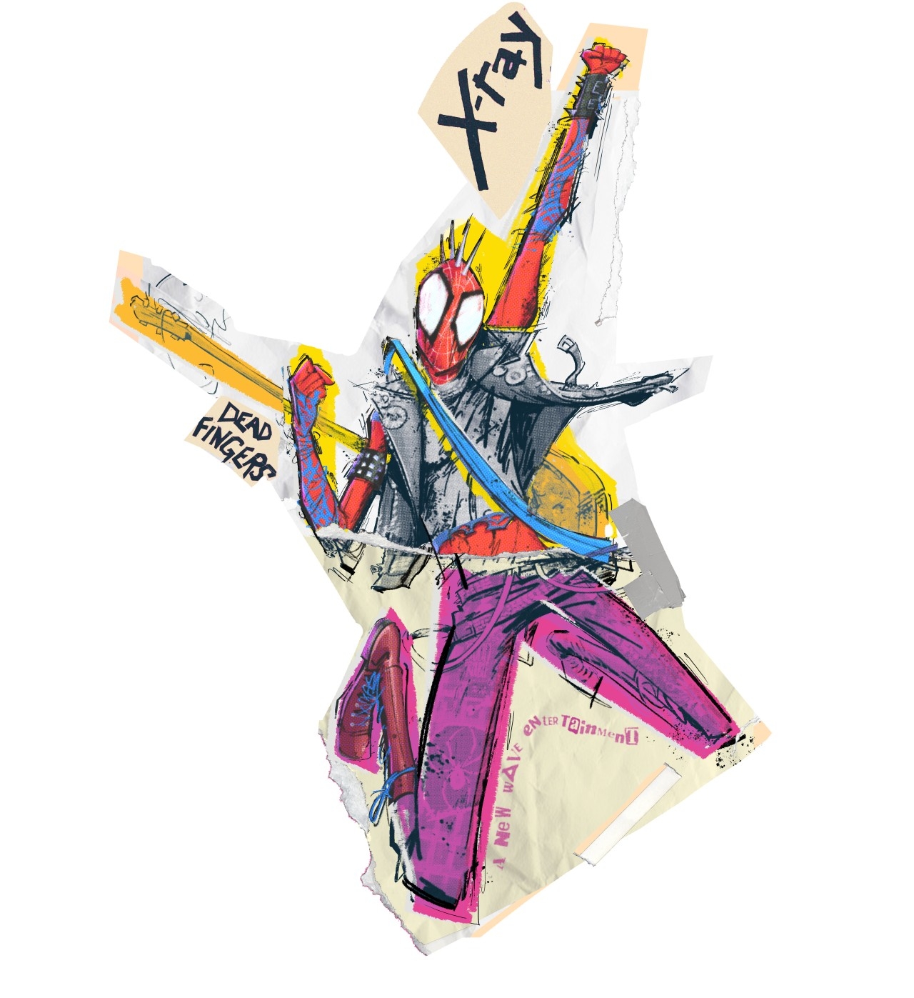
Hobie’s character design and his world’s aesthetic – animated in cut-out stylings – is based in 70s punk rock magazines, and his home, Earth 138, a cross between London and New York City. Like The Spot, Hobie disrupts the modern, slick look of Spider-Verse. But, unlike The Spot, Spider-Punk’s world is chaotic, busy, and actually looked better on paper than in initial executions.
“Artistically, when it comes to the creation of any of the worlds on the film, and even anything beyond the film that I do on my own, I always look at my toolset first, and the tools available to the artists during the time that were inspiring these designs,” explains O’Keefe. “For London’s 70s punk, it's super limited. It's a Xerox machine, the London newspapers, a stack of rock magazines, some masking tape, razor blades, highlighters, staples, and grease sticks. We were literally taping things together and scanning them in, leaving staples and razors and a big mess on this Xerox as we went. And that really works well as a 2D medium. As a 3D moving medium, it causes a ton of problems.”
Hawkins adds, “We had some pretty unsuccessful tests where we were trying to make different limbs have different render looks, as if he was being cut out of different magazines. But it just didn't translate well. It just looked incomplete. And not in a cool way.”
And for Hobie, being the very essence of cool, that just wouldn’t do. So poor Hobie ended up on the backburner for a long time as the team wrapped up other characters and environments. Eventually, the crunch time came to making final decisions for Hobie.
“When we started with him again, we realized it wasn’t about having different parts of his body being different things, it's more about different layers of him having different looks, with his body being on a frame rate of fours and his vest being on threes, or vice versa,” explains Hawkins. “And the cut-out edges of him are always dancing, acting like a keep-alive and providing his character with continuous noise. His guitar, however, has the lowest frame rate because it doesn't need a lot of fidelity. It’s more of an accessory.”

The crew also wanted to make Hobie’s environment as real as possible with newspaper clippings and magazine article cut-outs but were having trouble getting licensing rights to lots of the London newspapers. That problem was solved by hiring an outside artist to make several broadsheets of fake London newspapers that talk about events taking place in Hobie’s 138 world.
“The artist we put on this doesn't work in animation – well, I guess he does now – but he's a graphics artist for live-action and had made the newspapers look like real-world stuff, which then would get processed and broken up and sort of abused, and then we would slice it all up and put it together,” shares O’Keefe. “A bunch of the crew members also had babies during production, so there's a shot when the cops turn in the babies during the riot scene and all their faces are photos of our crew’s babies. One of them is actually my new niece.”
Hobie’s character design and world design prove that less rules don’t mean an easier design or production process. In fact, it usually means the opposite. But it does mean that no idea is a dumb one, there’s plenty of room for innovation, and even more room for recruiting artists that disrupt tradition, be it a live-action newspaper designer or a 14-year-old stop-motion animator.
“As the production went on, I kept looking for those people that had a really weird path to get into my purview,” notes O’Keefe. “I was a graffiti artist turned illustrator, who then dropped out of illustration school to chase a girl across the country, and then went into film design, and then went into video games, and now I’m making an animated film. It's like this weird collection of experiences. And those are the people I became really interested in working with because the movie itself wasn't this traditionalist approach. It was ‘by any means necessary.’”
The only question that remained as the crew wrapped on Hobie was whether or not a 2023 audience would appreciate the rough, edgy look from someone of the 70s. The answer was a resounding, “Hell yes.”
“A big takeaway from this has been that I'll never ever, ever, ever underestimate the audience's appetite and tolerance for something brand new,” O’Keefe shares. “And that, for me, is uncharted territory. And I think that’s uncharted territory for mainstream Western animation. If we opened the door on the first film, we blew it open on the second film, and there's no closing it now. Whether it's contemporary or not, cool is cool.”
The Spot and Hobie are Across the Spider-Verse’s underrated all-stars for the narrative benefits that come from breaking the rules with animation. And this sequel’s team of artists, whose numbers far surpass those of the first film, have proven they can build, break, brutalize, and beautify their artwork over and over across more than two hours of run time, and viewers will beg for more.
O’Keefe describes it as “doing bespoke 100-million-dollar blockbuster filmmaking.”
“Because it is so handcrafted,” he says, “Sony can feel like a small studio and almost like an indie arthouse studio at times, and then, all of a sudden, you are making these giant blockbuster movies with Spider-Man, the biggest character of all time. But it's really just a bunch of art school nerds hanging out being like, ‘Hey, wouldn't it be cool if we did like an Oskar Fischinger opening to the movie?’ A film like this is hyper, hyper-creative, and has a ridiculous attention to detail. I think that can only happen when you empower the one thousand people making it to trust you. There's an energy and a passion in that work that is unfiltered. And that's what I think makes it so appealing.”
Victoria Davis is a full-time, freelance journalist and part-time Otaku with an affinity for all things anime. She's reported on numerous stories from activist news to entertainment. Find more about her work at victoriadavisdepiction.com.


