Art director Sierra Lewis built on creator Tony Hale and director Eric Fogel’s vision to design a fantastical, sweater-wearing chicken’s world that felt sophisticated, textured, and cinematic.

For art director Sierra Lewis, diversity and accessibility were the first building blocks she, director Eric Fogel, and creator Tony Hale used to conceive the sophisticated, colorful, and wildly wacky sets for the sweater-wearing chicken world of Archibald's Next Big Thing.
“From the beginning, Eric and Tony had a very clear vision of what they wanted the world to feel like,” remembers Lewis, known for her work on The Simpsons and The Tom and Jerry Show. “We had a few development art pieces that we used as jumping off points, and the main take away from those pieces was that we wanted Archibald's world to feel cinematic and textural with a good deal of atmosphere.”
“But the real beauty of the world we created,” she continues, “is that regardless of what type of animal we had or theme of the town, everyone lives together to create a diverse world that is accessible for all. This created some really fun design challenges, and my team and I really enjoyed it.”
Based on Hale’s children’s book of the same name, the 2D animated series by DreamWorks Animation Television takes place in the eclectic town of Crackridge - home to roosters, goats, unicorns, and more - and follows the adventures of a bright yellow, and endearingly clumsy, chicken named Archibald (voiced by Hale) and his three siblings. The show is now on Season 4, continuing with the latest installment, Archibald’s Next Big Thing Is Here!.

Lewis was brought onto the Archibald team by line producer Carter Malouf and executive producer Fogel to help flesh out not only Crackridge’s design, but the show’s surrounding towns like Saddle Rock. From suburban neighborhoods and deserts to lush forests, sandy beaches, and snowy peaks, there was a lot of ground to cover to create one consecutive world made up of environments that catered to a variety of human-mannered animal species.
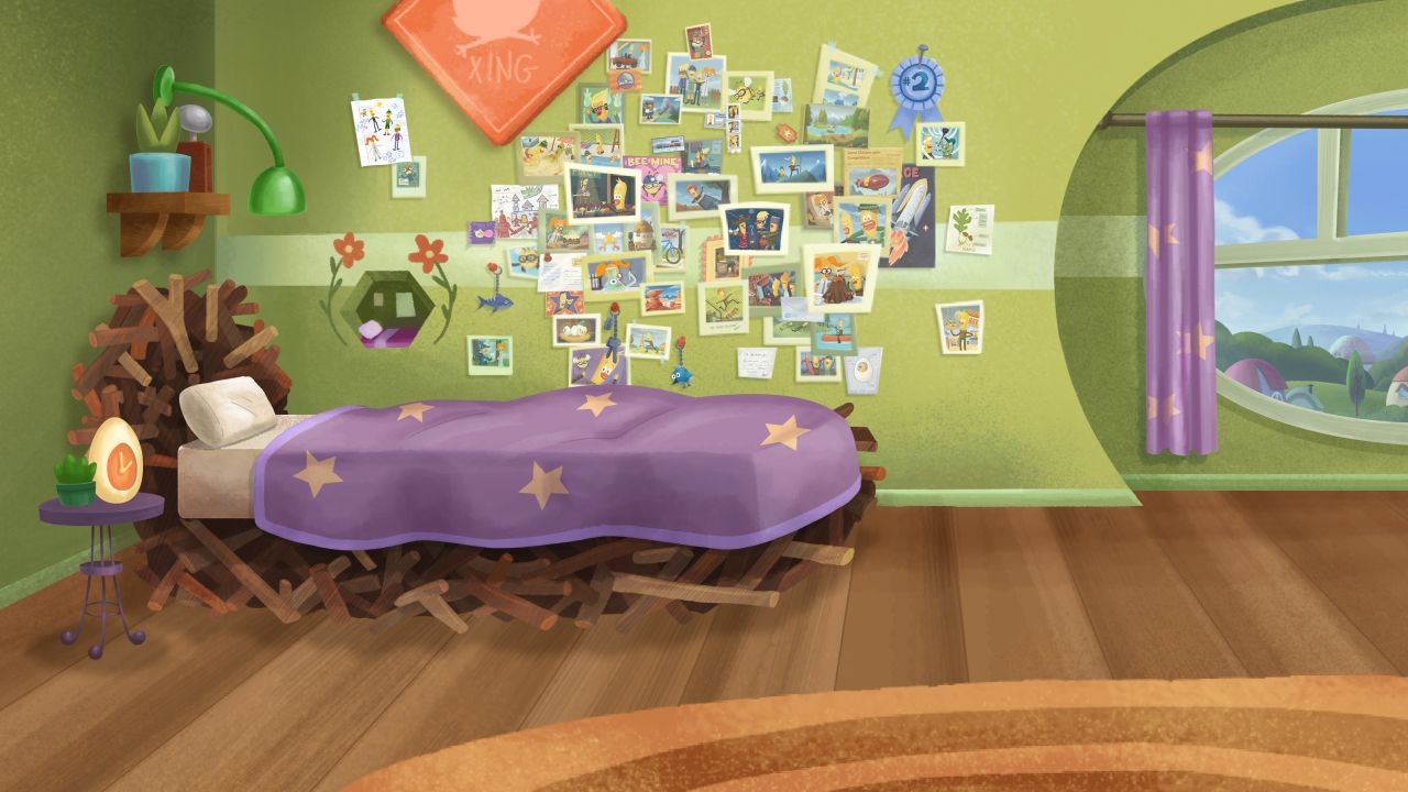
“With the city of Crackridge in particular, Eric really wanted to accentuate the bird-centric architecture,” Lewis explains. “So, anywhere we could fit in an egg or birdhouse or chicken themed element, we made sure to add in those details so that it really felt like the avian citizens were right at home.”
Most of the homes on Archibald’s own block are in the shapes of eggs, as is his alarm clock.
Lewis adds, “But different towns, like Saddle Rock for instance, cater more towards the horse-type people who live there. So, barns for houses, and a more western aesthetic, worked well with the more high desert environment and color scheme.”
While designing home furnishings, landscapes, and overall environments for the show’s animals was a big part of bringing the Archibald universe to life, another was color.

“Since our main characters have very bright yellow faces, we needed to find a color scheme that complemented and did not compete with them,” notes Lewis of her exceedingly xanthous TV stars. “Our color palette, while bright and fantastical, is quite nuanced, and we took a lot of care in ensuring that the environments showcase our characters in all lighting conditions while also giving a lush and eye-catching appearance.”
As detailed and beautiful as a David Shannon paint-styled children's book, Archibald’s vibrant sets show the captivating magic behind 2D illustrations that give off the aesthetic of 3D animation. All the show’s color schemes feel radiant and crisp but textured and shaded to show you what a touch might be like.
“Archibald's Next Big Thing has some of the most elegant and sophisticated color language I've ever seen for a show of its intended demographic,” says Lewis, who produced most of Archibald’s design and color work in Photoshop. “Generally, ‘Preschool’ or bridge-type shows tend to rely on a lot of oversaturated colors to grab the attention of the viewer. But this show takes feature quality painting techniques and creates a world that is as entertaining as it is immersive and beautiful to look at. On every episode, we worked hard on our color scripts to elevate the acting and tone of the story at that point in time.”
Bedspreads, massive water slides, and egg house roofs all have realistic qualities that look surprisingly at home in such imaginative surroundings.
“Time of day and lighting can affect so much of how a scene is interpreted, so my team and I are thankful that we were given the time and resources to add those details into each episode,” notes Lewis. “I think this quality and attention to detail really helps our show stand out and makes it something special.”
And knowing how to balance that realism with the fantastical has been key to achieving Archibald’s unique charm. According to Lewis, it comes down to what will best serve the story and carefully riding the line between being too distracting and being too tediously realistic.
“If your world is so distracting that your viewers can't focus on the story and characters, then I think it's best to find a balance,” she says. “This can be said about pretty much every aspect of design for animation. For a story like Archibald's Next Big Thing, it was apparent to us very quickly that we needed to strike a balance between the bird themed elements and the more universally recognizable objects that make up the infrastructure of Crackridge. So, even if we have houses shaped like eggs, we still have sidewalks, streets, and traffic lights that play into the theme but are still immediately recognizable to our audience.”
An even bigger challenge for the production team was tackling the second season of Archibald’s Next Big Thing is Here!, which expanded adventure territories exponentially. But, according to Lewis, it was a welcomed learning experience.

“We went to a lot of different new worlds and locations and got to really flex our design muscles on some fun episodes,” the art director says. “It's not too often that you get to go back to Roman times, a fantasy realm, inside an 8-bit video game, a valley full of man-eating plants, and inside a Tooth Pirate-themed dreamscape all in one season. Regardless of where the episodes took us, my design team was incredibly inspired by the boards and scripts, so we came up with some really fun and clever design solutions that looked great and were beautifully executed.”
Lewis attributes much of the show’s production success to their creative team having the same building blocks and “core values” that they exercised for the show itself and illustrated through its lovable main character.
“The core values of the show that Tony Hale instilled in Archibald -- ’Stay in the moment. Keep Your heart open’ -- branched out into the working philosophy and culture of our show,” Lewis shares. “Being present and having empathy for others created a great working environment. Every artist was given the opportunity to shine and add their creative input, and all departments collaborated very openly so that we were able to give this show our very best.”
Victoria Davis is a full-time, freelance journalist and part-time Otaku with an affinity for all things anime. She's reported on numerous stories from activist news to entertainment. Find more about her work at victoriadavisdepiction.com.


